While starting your veterinary business, you want to plan certain veterinary marketing solutions to increase your business’s performance. Therefore, you have to pay close attention to the details of your website’s web design and content. The web content contains the text and the graphics of the web pages designed for a website.
Your web design company should ensure that your internet business messages are clear, complete, and attractive to customers as you would expect in any of your high-quality advertising in another printed advertisement. Here are simple web design tips to attract more customers for your veterinary clinic.
Make a Simple Feature of Customers Book Appointments
Nowadays, people want something fast and sure. So, you should make sure that your website has a feature of customers book appointments. This feature should be easy to navigate and simple. To make it happen, you can try to make this feature button (‘book now’) more visible. You can also send an email to your potential customers that they can book an appointment online through your website. If you want to increase this feature’s use, you can also try to leverage your social media channels. So, your customers will know that they can use your service easily. Hence, your business will grow faster.
Increase the Loading Speed
 Users don’t like to wait long. No one can be more impatient than someone who regularly surfs the Internet: they would like to find the information they need immediately and without delay. There are now competing sites with similar information readily available, there is no fantastic reason for customers to wait for a website to load, as they could get what they need elsewhere.
A website’s loading time can be reduced by maximizing images and web code and eliminating unnecessary widgets and plugins that are not needed. Also, it is best to purchase a loading message to have a timer or even some other progress indicator. People are more likely to stick around if they know the exact time it will take to log in, rather than waiting endlessly for it to load.
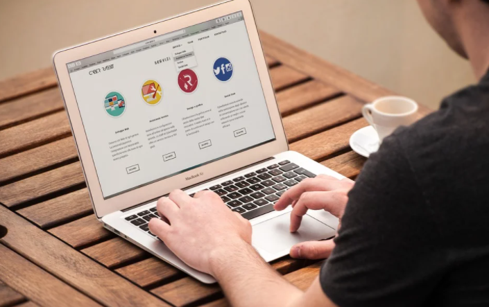
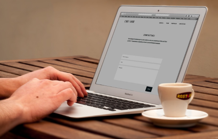
Make Sure It’s Easy to Navigate
A website should be built in a way that makes it easy to navigate, so that people can immediately find the information they need. If the structure is complicated and the text is hard to understand, visitors will be frustrated and go to another site. Also, website owners should make sure that the text is readable. It shouldn’t be so small that people have trouble seeing it, and it shouldn’t be so large that it looks unprofessional.
Go to the Point Directly
The information provided should be brief but complete. There should be no distractions or distracting elements to keep people focused, such as an image (that is eye-catching to close) over the material. A website that deals with publications (such as a technical advice/gossip topic) need extra time for people to see it. The time can be extended by using elements that point to relevant material.
Suppose a visitor arrives at a web page with an article on how to get rid of a particular computer virus from their computer. In that case, it should contain links to other articles dealing with similar topics (e.g., antivirus software). Hyperlinks can be included within the guide to describe the phrases and techniques of the latest post and a recommendation to read it. In this way, the place a visitor land acts as a gateway to other pages.
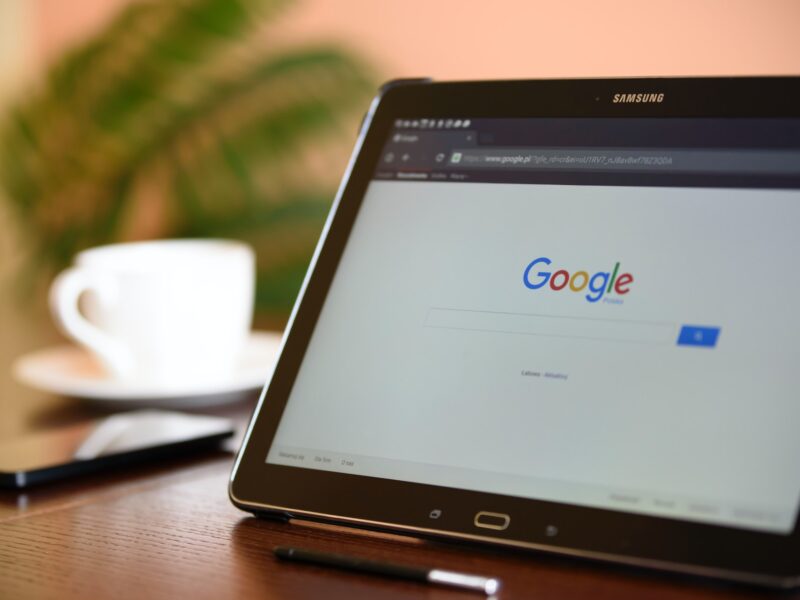
Add Multimedia
Ethnic implications aside, this is not a wonderful development regarding the Internet. People now prefer to listen to music, play games, and look at pictures rather than read text. As a design position solution, web designers can make the content much more attractive by accompanying it with an attractive image clip or related images. Since visual elements can create interest and curiosity, they convince people to look at the text to learn more.